Disaster Aid is a web application which enables disaster survivors to request and monitor emergency assistance across federal, state, local, tribal, volunteer and private sector organizations.
The Goal
My goal as a UX Designer on this project was to ensure that the overall experience for this website was exceptional, consistent, and valuable. In alignment with the project’s mission, I aimed to design the new website as an agency-neutral, survivor-centric portal through which disaster survivors could effortlessly request the help they need to rebuild their lives.
Challenge 1: Improving Global Navigation
Some enhancements were merely byproducts of the work I was doing on the application for assistance and survivor dashboard. The global navigation, which I personally considered to be heavier than it needed to be, was a focal point in my efforts.

Three of my biggest issues with the existing navigation (above) were:
- Calls to action were unclear as the icons were neither intuitive or clearly labeled.
- White space and dead space are two different concepts. Here, I believed we had too much dead space in play (right above the calls to action) and that we could be more purposeful in our real estate decisions. While this is addressed in the collapsed, sticky navigation, its pre-sticky version stood to be improved.
- I felt like we were missing an opportunity to integrate the web application with the website via the global navigation.
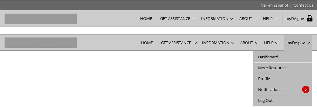
Going back to "my issues"...here's how my design addressed those:
- Several of the calls to action did not need to exist where they did in the navigation bar. Printing the screen contents was achievable by utilizing the browser's native printing functionality. Site contact and translation capabilities were spelled out and captured in utility navigation.
- By pairing down icons, this left more room for navigation elements and branding to breathe. This enabled the team to make more sensible use of real estate without introducing clutter.
- Integrating the application into the main website was a primary reason why I took a stab at redesigning the site navigation at all. The experiences of the main site and the application login screen appeared to be disjointed and, by introducing a link to login to/register for "myDisasterAssistance" in the main navigation, I was able to begin establishing a clear-cut connection between the two entities (branding aside) as work began on unifying the respective interfaces.
Challenge 2: Improving the Assistance Application Experience
It was not clear to me if I completed the purpose of my visit or not.
Lorem ipsum dolor sit amet, consectetur adipiscing elit, sed do eiusmod tempor incididunt ut labore et dolore magna aliqua. Ut enim ad minim veniam, quis nostrud exercitation ullamco laboris nisi ut aliquip ex ea commodo consequat. Duis aute irure dolor in reprehenderit in voluptate velit esse cillum dolore eu fugiat nulla pariatur. Excepteur sint occaecat cupidatat non proident, sunt in culpa qui officia deserunt mollit anim id est laborum.
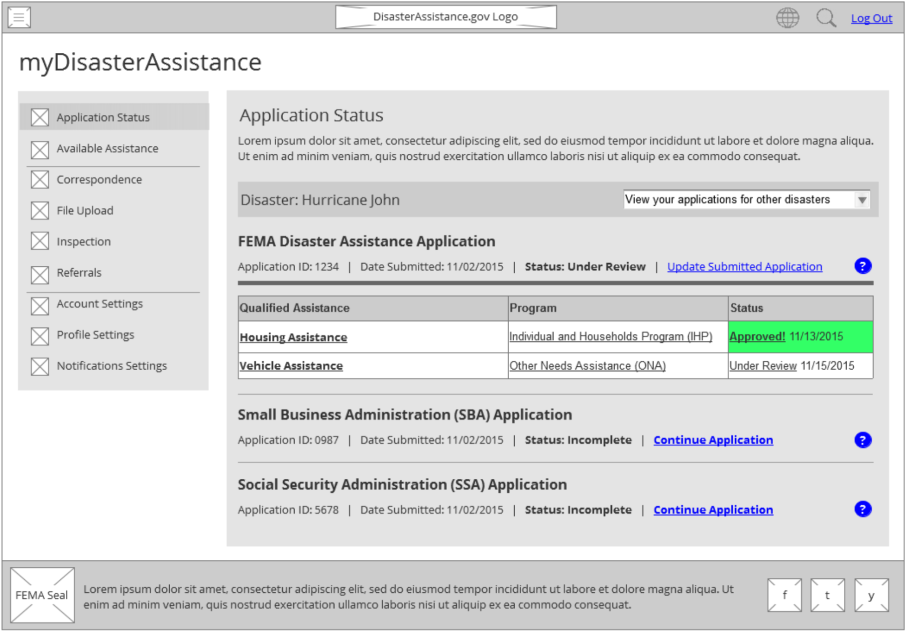
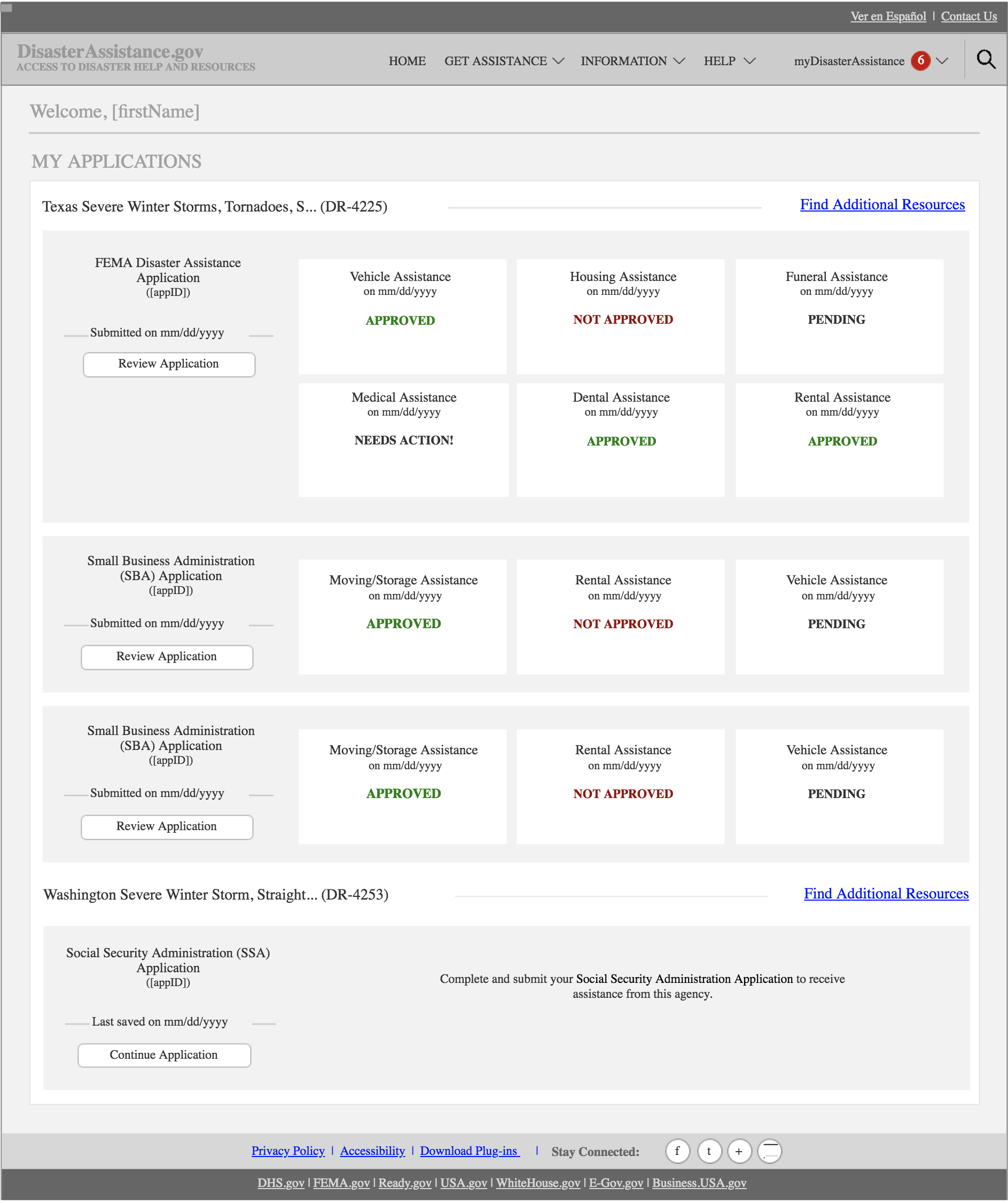
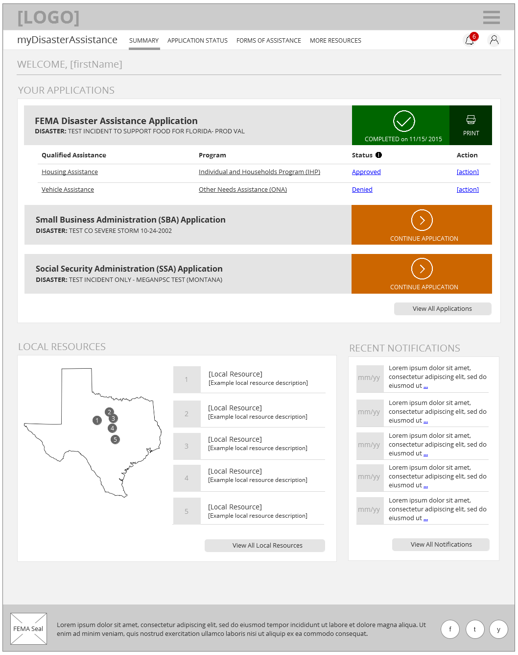
Challenge 3: Designing a Survivor Dashboard
I think that it would be easier for applicants to see the status on their applications and how far along the process is. I have not received any phone calls or emails about the status of my application and it's been almost a month.
Lorem ipsum dolor sit amet, consectetur adipiscing elit, sed do eiusmod tempor incididunt ut labore et dolore magna aliqua. Ut enim ad minim veniam, quis nostrud exercitation ullamco laboris nisi ut aliquip ex ea commodo consequat. Duis aute irure dolor in reprehenderit in voluptate velit esse cillum dolore eu fugiat nulla pariatur. Excepteur sint occaecat cupidatat non proident, sunt in culpa qui officia deserunt mollit anim id est laborum.
Challenge 4: Facilitating a More Intuitive Document Upload Process
I could not find the 2 documents a representative told me were online.
Lorem ipsum dolor sit amet, consectetur adipiscing elit, sed do eiusmod tempor incididunt ut labore et dolore magna aliqua. Ut enim ad minim veniam, quis nostrud exercitation ullamco laboris nisi ut aliquip ex ea commodo consequat. Duis aute irure dolor in reprehenderit in voluptate velit esse cillum dolore eu fugiat nulla pariatur. Excepteur sint occaecat cupidatat non proident, sunt in culpa qui officia deserunt mollit anim id est laborum.


Takeaways
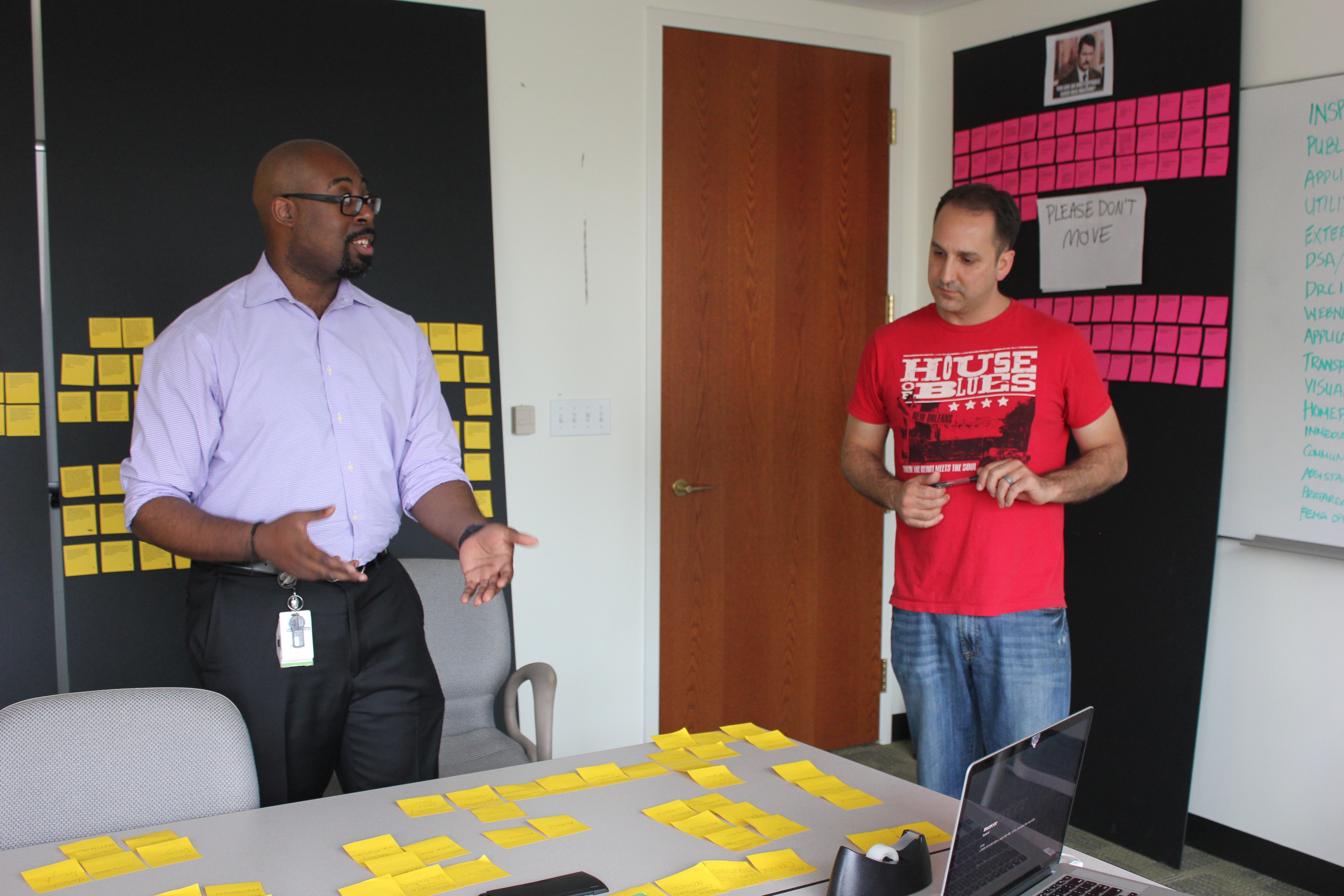
This project was a case study in user advocacy. A key obstacle in this initiative was a reluctance to allow user insights to inform design. Clients believed they understood the disaster survivor experience enough to warrant the neglect of user research. Once the team was in a position to present a high volume of genuine qualitative data in a physical representation, the client was unable to challenge it.